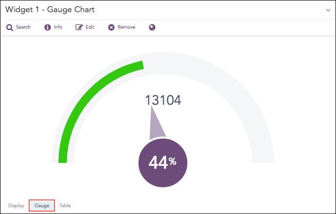
Gauge chart, also known as speedometer chart, uses a single needle to show the information as a reading on a dial. The graph is used to visualize percentage values as well as a fixed range of data.
Count of logs with the minimum value
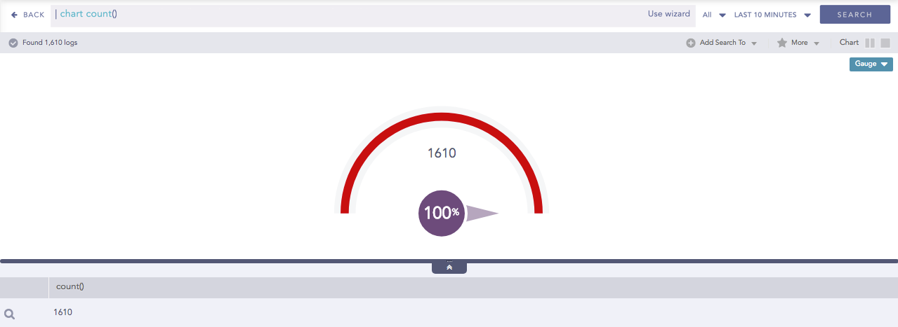
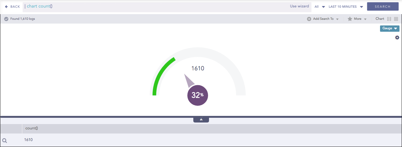
The following query gives the output shown above.
| chart count()
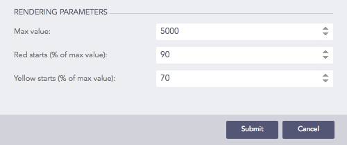
The value of the aggregation parameter determines the value pointed by the needle. You can configure the maximum value of the dial from Max value while rendering parameters. When a value of the aggregation parameter is equal to, or greater than the Max value, the percentage value of the needle is displayed as 100%.
Three different colors, green, yellow, and red are used to represent the limits for the data being depicted in the gauge. By default, the green, yellow, and red colors represent the low, mid, and high range of values respectively. However, you can configure the threshold value (in percentage) to display the dial in the yellow and red colors.
The Gauge chart supports a single aggregation response types for representation of search results in the visualization. It is:
Response Type |
General Syntax |
|---|---|
| chart aggregation_parameter
|
Gauge chart for Single Aggregation without Grouping
To view the search results in a Gauge chart, select Gauge from the drop-down menu on the top-right corner of Search Result page.
You can refer to Single Aggregation without Grouping for more details.
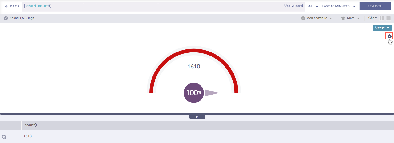
Click the settings icon on the right side of the chart container to open the Rendering Parameters panel.
Gauge chart for Single Aggregation without Grouping
Rendering Parameters Panel
You can specify the threshold value for the red and yellow colors in the Red Starts and Yellow Starts configuration fields on the Rendering Parameters panel.
Note
The value of Red starts is 90% and Yellow starts is 70% by default.
Rendering Parameters of Gauge chart